We all love the star, the Fablab Saigon star. In the brief for the design of the original Fablab Saigon logo, we wanted something that would tell about Vietnam yet follow the principles of the original Fablab logo, with the 3 red, green and blue colors and “building” pieces. That’s how Arnaud came up with this refreshing star. We were very proud of the ironman effect of the logo on our very first T-shirt. Ironman is the perfect adventurous maker, and that is somehow what we wanted to be, self-tinkered super heroes!
After more than two years, we feel it is time to move on. We often say that Fablab is a venue, a community and a network. Let’s not forget that Fablab Saigon is also a team. And while some of us in the team have been here from day one like Nhan and Hoang-Anh, every new member, even only part-time or volunteering, is like a new co-founder. They add a unique influence that shapes anew Fablab Saigon. The wish to look more professional and to have not only a logo but a full and consistent brand visual identity through our material was raised very early on by Mai and then Trí when they joined. So they naturally took the lead and ownership when we got the opportunity to do so.
It is NIFTIT that provided us this opportunity. They generously offered to work pro-bono on building this new brand identity with us. For the new logo, we asked for a lighter design, one that could be flatten 2D and black & white, one that could be easily integrated to other designs, flyers, posters and t-shirts. The new logo would still reflect the creativity, the dynamism of our organization and its community.
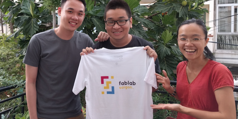
We are very happy with the result. The new logo still uses the concept of building blocks, with 3 colors. But this time we gave up on the global Fablab logo colors. Pink, blue, yellow, these soft yet joyful colors reflect our strong commitment to openness and diversity in gender, background, profession and age. The simplicity of the design advocates for accessibility. Among the logo pieces, the S of Saigon of course, but only the careful eye can see that the pieces don’t quite fit to form a square. This is a call for curiosity, ingenuity and open-mindedness.

Mai, Tri from Fablab Saigon and Danh, designer from NIFTIT are happily showing the result of months working together
Changing our logo and visual identity is a challenge, but also a strong statement that we are ready for what comes next. We are proud of who we are, with our achievements but also our mistakes and failures. We are a young organization, we are continuously learning, and our intent is to remain so.
The new logo is less passionate and more lean. We can somehow say that we have entered the age of reason. But don’t get us wrong, it’s not because we are less ambitious, crazy or in love with what we do at fablab. Not only has the organization matured but more importantly we’re not the only ones passionate about fablab. We’re giving up our star because Fablabs in Vietnam go beyond Fablab Saigon, with Fablab Danang, Fablab Hanoi, etc. And hopefully more with the latest Mobile Fablab project. And while Fablab Saigon will continue to shine with its new logo, together we’ll rise as a new star.
If you need our new logo, you can download it here.


